Version: v11.9.4

Create Prefab using Angular Module


In this section, we will list the steps in creating a Prefab using an AngularJS module. For this we will be using the AngularJS tree module provided here. Below example is based on v2.15.0. We need to download the css and js files.

Creating Prefab

  1. From the Prefab tab in Project Dashboard, click on the Create Prefab icon.

prefab_create1

  1. Enter Name and Description and click on CREATE.

prefab_create2

  1. From the Prefab Settings dialog, SAVE without any changes.
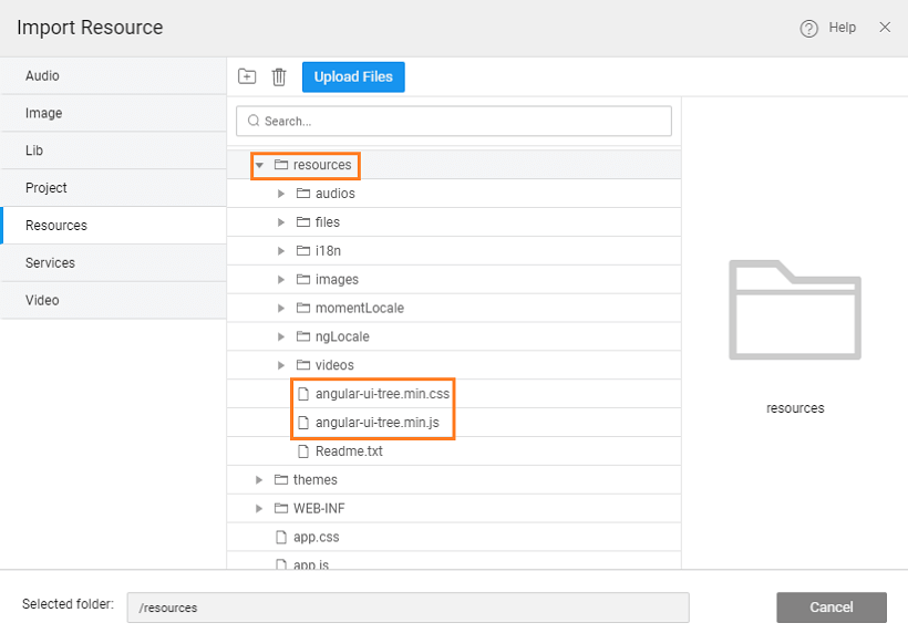
  2. Import the css and js files to the resources folder, using the Import option from Main Menu.

import_resource1

prefab_angui_resource

note

Ensure that the resources folder is selected for the import.

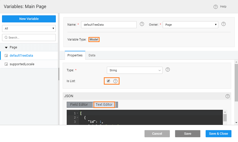
  1. From Main Menu use Create option to Create a Static Variable, defaultTreeData, to hold the default tree structure. Select the is List option and enter the Json structure. The structure needs to include id, title, and nodes for subitems.

Here we have used the structure provided at the website.

[
{
"id": 1,
"title": "1. dragon-breath",
"nodes": []
},
{
"id": 2,
"title": "2. moiré-vision",
"nodes": [
{
"id": 21,
"title": "2.1. tofu-animation",
"nodes": [
{
"id": 211,
"title": "2.1.1. spooky-giraffe",
"nodes": []
},
{
"id": 212,
"title": "2.1.2. bubble-burst",
"nodes": []
}
]
},
{
"id": 22,
"title": "2.2. barehand-atomsplitting",
"nodes": []
}
]
},
{
"id": 3,
"title": "3. unicorn-zapper",
"nodes": []
},
{
"id": 4,
"title": "4. romantic-transclusion",
"nodes": []
}
]

prefab_angui_statvar

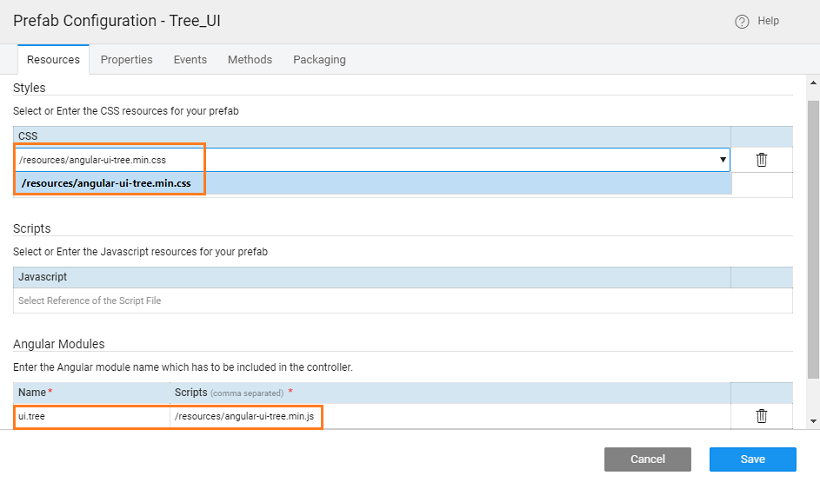
  1. Set the following Prefab properties, from the Prefab Settings:

    • Add a Style to include the imported css file.
    • Add module, give the name ui.tree and point it to the uploaded js file. Note: The module and its name is the requirement of the angular module being implemented. Use the same name.

    prefab_angui_resourcesettings

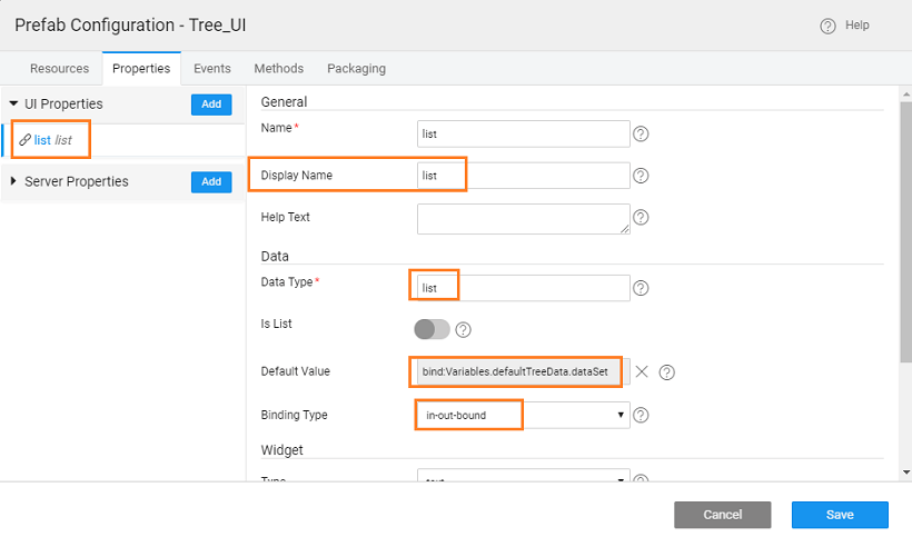
    • Add a property

      • Name & Display Name as list

      • Data Type set to list

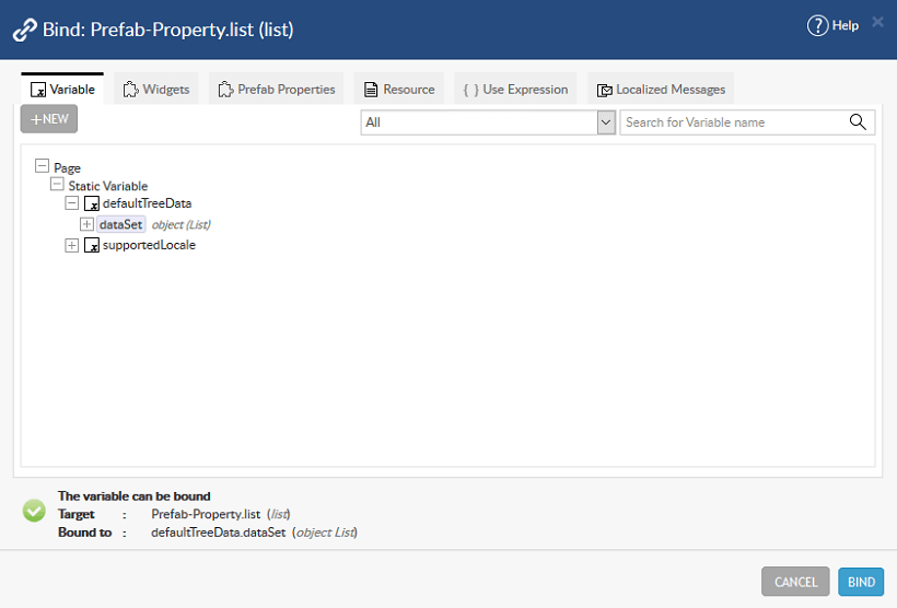
      • the Default Value bound to the static variable, defaultTreeData created

      • the Binding Type set to in-out-bound

      • Widget Type as text

        prefab_angui_props

        prefab_angui_propbind

    • APPLY changes and CLOSE the dialog

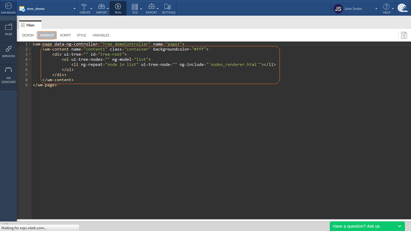
  2. Define the template in html markup as:

<wm-content class="container" backgroundcolor="#fff" name="view1">
<div ui-tree id="tree-root">
<ol ui-tree-nodes ng-model="list">
<li ng-repeat="node in list" ui-tree-node ng-include="'nodes_renderer.html'"></li>
</ol>
</div>
</wm-content>

prefab_angui_html

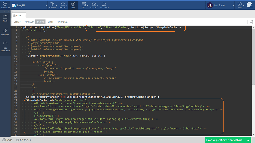
Script to include the following functions to be trigger whenever a property defined inside a prefab is changed. This also will generate the html file included above:

note

Be sure to include $templateCache in the first line of the Script in two places.

$templateCache.put('nodes_renderer.html',
'<div ui-tree-handle class="tree-node tree-node-content">' +
'<a class="btn btn-success btn-xs" ng-if="node.nodes && node.nodes.length > 0" data-nodrag ng-click="toggle(this)">' +
'<span class="glyphicon" ng-class="{'glyphicon-chevron-right': collapsed, 'glyphicon-chevron-down': !collapsed}"></span>' +
'</a>' +
'{{node.title}}' +
'<a class="pull-right btn btn-danger btn-xs" data-nodrag ng-click="remove(this)">' +
'<span class="glyphicon glyphicon-remove"></span>' +
'</a>' +
'<a class="pull-right btn btn-primary btn-xs" data-nodrag ng-click="newSubItem(this)" style={marginRight: "8px"}}>' +
'<span class="glyphicon glyphicon-plus"></span>' +
'</a>' +
'</div>' +
'<ol ui-tree-nodes="" ng-model="node.nodes" ng-class="{hidden: collapsed}">' +
'<li ng-repeat="node in node.nodes" ui-tree-node ng-include="'nodes_renderer.html'"></li>' +
'</ol>'
);
$scope.remove = function (scope) {
scope.remove();
};

$scope.toggle = function (scope) {
scope.toggle();
};

$scope.newSubItem = function (scope) {
var nodeData = scope.$modelValue;
nodeData.nodes.push({
id: nodeData.id * 10 + nodeData.nodes.length,
title: nodeData.title + '.' + (nodeData.nodes.length + 1),
nodes: []
});
};

prefab_angui_script

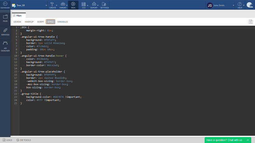
Add required styles:

.btn {
margin-right: 8px;
}
.angular-ui-tree-handle {
background: #f8faff;
border: 1px solid #dae2ea;
color: #7c9eb2;
padding: 10px 10px;
}
.angular-ui-tree-handle:hover {
color: #438eb9;
background: #f4f6f7;
border-color: #dce2e8;
}
.angular-ui-tree-placeholder {
background: #f0f9ff;
border: 2px dashed #bed2db;
-webkit-box-sizing: border-box;
-moz-box-sizing: border-box;
box-sizing: border-box;
}
.group-title {
background-color: #687074 !important;
color: #FFF !important;
}

prefab_angui_styles

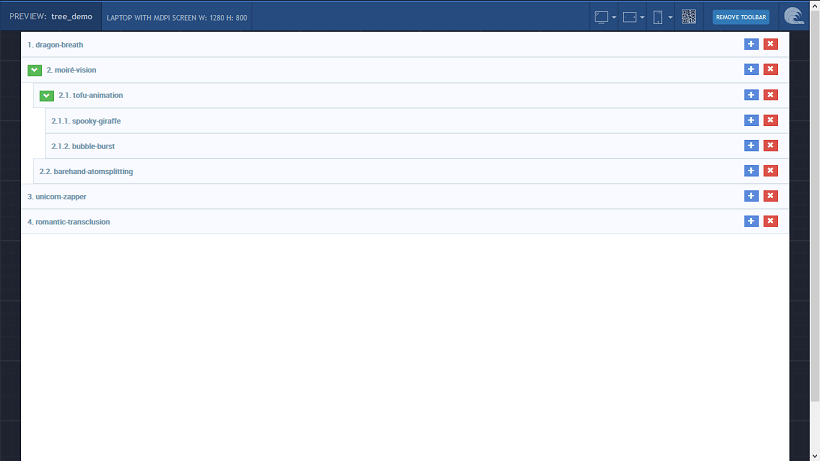
  1. Save and run the Prefab.

prefab_angui_run

  1. Publish the Prefab.

Using Prefab

To use the prefab in your application, Open the app where you want to use the Prefab

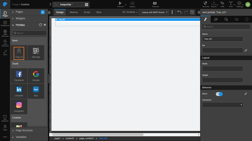
  1. Since the Prefab was published to workspace, you can see it in the Widget toolbox ready for drag and drop operation. Drag and drop the prefab onto the canvas and run the application.

prefab_angui_app

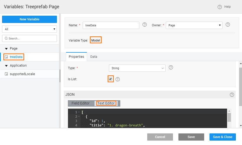
  1. You can bind the prefab list property to any list and change the tree structure. We have created a static variable with the following structure and bound it to the list property.
[
{
"id": 1,
"title": "node1",
"nodes": [
{
"id": 11,
"title": "node1.1",
"nodes": [
{
"id": 111,
"title": "node1.1.1",
"nodes": []
}
]
},
{
"id": 12,
"title": "node1.2",
"nodes": []
}
]
},
{
"id": 2,
"title": "node2",
"nodrop": true,
"nodes": [
{
"id": 21,
"title": "node2.1",
"nodes": []
},
{
"id": 22,
"title": "node2.2",
"nodes": []
}
]
},
{
"id": 3,
"title": "node3",
"nodes": [
{
"id": 31,
"title": "node3.1",
"nodes": []
}
]
}
]

prefab_angui_appstatvar

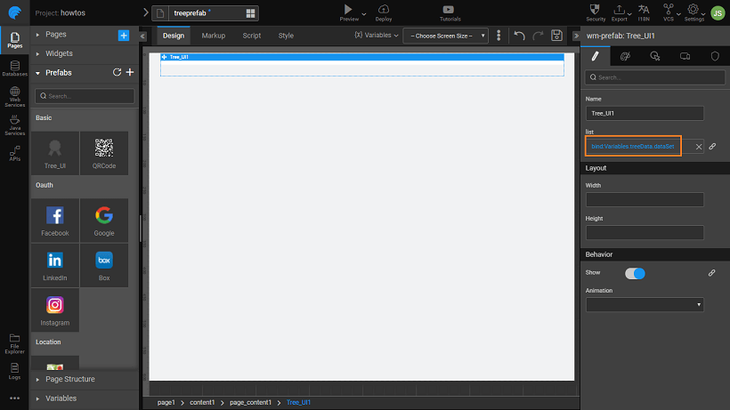
  1. Bind the List property of the Prefab to the Static Variable created in the previous step.

prefab_angui_appsbind

  1. Run the app and see the new tree structure

prefab_angui_apprun

See Also

Prefab to compare two strings
Prefab using 3rd Party UI Widgets
Prefab Using D3 & NVD3 Charts
Prefab Using D3 Library (DataMaps)