We released the new WaveMaker Docs site on the 14 November 2019. We migrated from WordPress to Docusaurus with easy-to-edit markdown files. This change has also increased the contributions from our team members.
Since the release, we continued to make changes and improvements to the site very frequently, and now we have fully adapted to the new GitHub workflow.
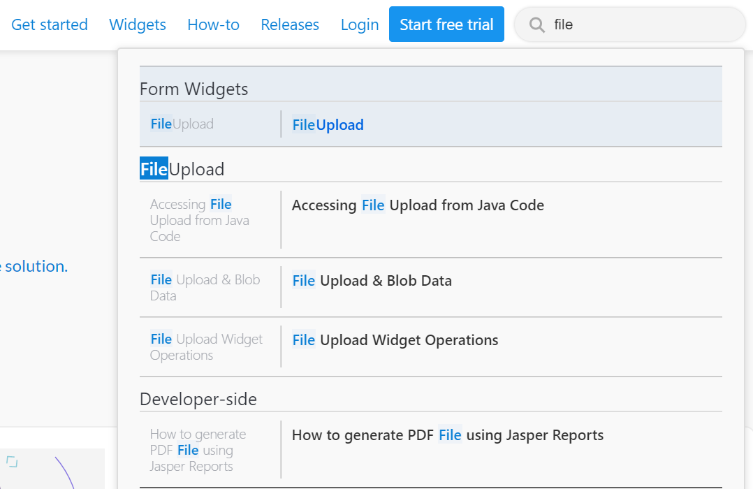
In the recent additions to the site, we implemented the search, which was one of the most-waited and most-requested features. While WaveMaker documentation is well-indexed by Google; additionally, it has the ability to search within the site, which makes it easy to discover content inside and outside.
What we used
Implementing an entirely new documentation site was a different story while integrating the search was another (read more). We went with algolia community project called 'DocSearch' which offers fast, accurate and robust search results.
Algolia DocSearch is a popular hosted search and many open-source communities use it, including React, Vue, Bootstrap, Netlify, Paypal, and more. It shows real-time results instantly as you type. We are happy with how it offered the flexibility to make our own customizations.
With DocSearch
- Algolia crawls documentation every 24 hours and creates a search index in its server.
- It automatically tracks internal links to make sure that the content does not miss away.
- It uses the semantics of the HTML structure to construct records.
The journey of the Search Implementation
We admit that the journey behind this implementation was quite interesting, in a good way of course. The integration with algolia DocSearch as a ready-to-use service was fairly smooth. Though, there were few challenges from Docusaurus for placing the search into the setup it offered.
Let's first see how it looked before and what we did to make the search look neat and responsive across all devices.
Search before
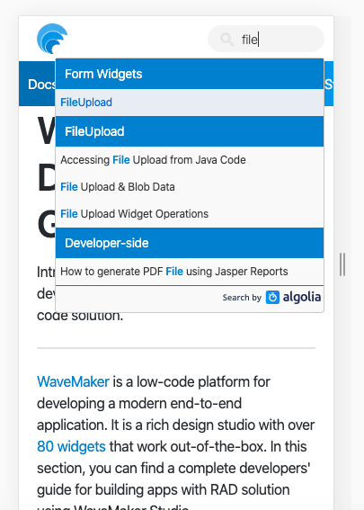
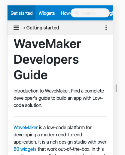
It did the job. But was it enough? Docusaurus does not allow modifying the header. The default search was overlapping the navigation menu in smaller screens. This hampered the user experience of mobile users. See the "before" screens below.
- In the mobile view, two headers were occupying more space and menu items were accessible only by scrolling horizontal ways.
- Default colors applied automatically, but content got over-crowded.
What we did
Docs are the key source to find solutions instantly with hundreds of documents to filter from. Algolia took care of the technicality, and we took care of the rest. We consulted our UX team and developer to customize the search to match our theme and display results to access docs with ease and responsiveness.
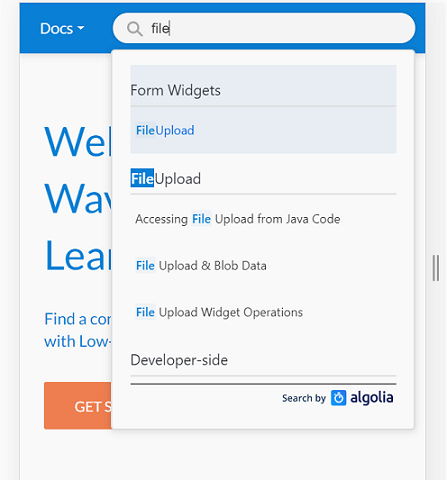
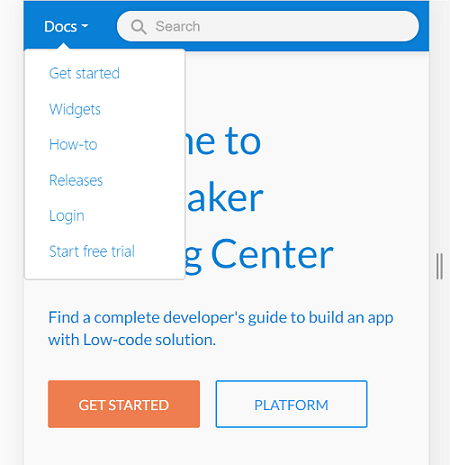
We developed a custom script that injects dynamic HTML into the website. This means, whenever the documentation page loads, it builds a dropdown menu with options while injecting it into the header in the hidden mode. It also adds event listeners to show and hide menu items. This dropdown works in the mobile view only. We hide the horizontal menu, whilst we expand the search area for better visibility as shown in the screen below.
ta-da!
When you access WaveMaker Docs in the mobile view, simply click the "Docs" option. It opens the menu vertically without interrupting the user experience. The dropdown menu can be closed by clicking anywhere on the page.
What more?
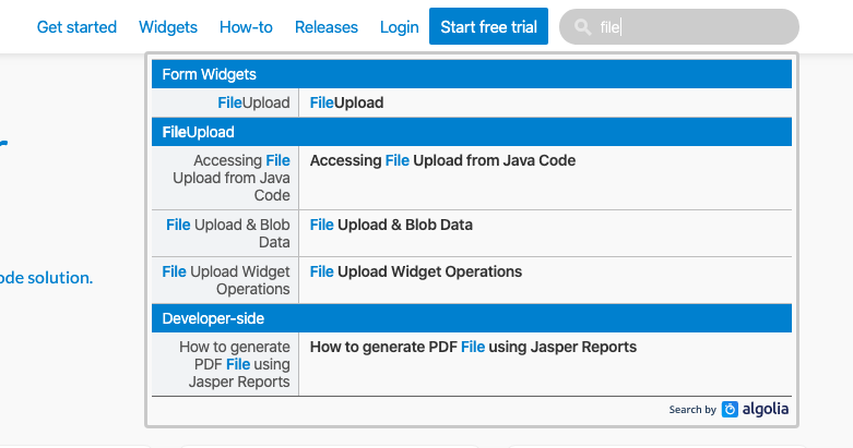
We improvised the web view, too!
Try it for yourself to see how fast and accurately it works.
If you are interested to learn more about how we implemented this, see the pull request details.
We are constantly working on improving the documentation to make it better every day. If you notice something broken, please report to us by logging an issue here.

