Creating and customizing the look and feel of WaveMaker applications is just a few clicks away now. We have introduced a theme building tool for changing color schemes and creating branding specs. Theme-builder brings the benefit of codeless theme creation in a few simple steps. With a built-in code editor, one can make changes and see custom styles instantly applied to the web components.
A theme is a preset package containing graphical appearance details. It is often used to change the look and feel of multiple things at once, which makes the elements less granular than allowing the user to set each option individually. For example, you can specify your company's branding colors for your project.
Link to the app: http://apps.wavemakeronline.com/Theme_Builder/#/Dashboard
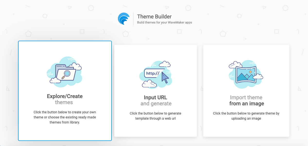
Customize color, typography, and style
To begin customizing a theme, one can modify values for color, typography, and style. By default, the preview application starts with the material theme applied. We can switch between different theme styles and instantly preview the changes.
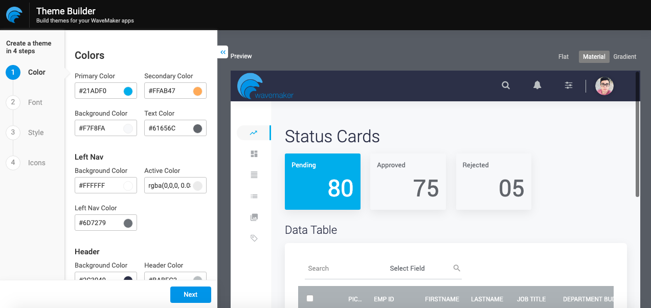
Color
To change your theme colors, replace the predefined #HEX color code with a custom color.
Primary color maps to all active components and elements like(primary buttons, selected tabs, nav items, etc), while secondary color accents the icon colors for date and time selection. Background color applies to the scrollable content, while the text color maps to the body text and captions used in the application.
Header and Left nav colors define the coloring scheme for background, text, and active links. We also have More options to handle the notification and disable state colors.
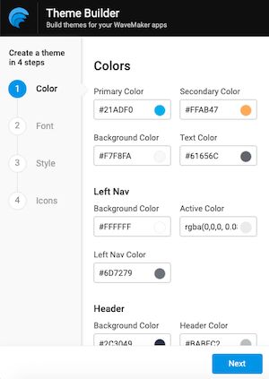
Typography
To change your theme's typography, choose the options from the dropdown, be it font-family, or the size of headings and body text.
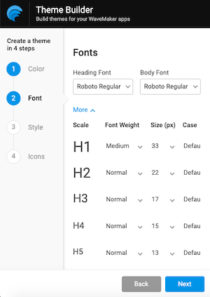
Style
Applying different styles like Flat, Material, and Gradient. This will help you understand how the components change. Each selection will override the existing behaviour of the elements displayed in the preview section.
Flat: The flat-theme includes a solid background to the elements with active states. It also adds an outlined border for user inputs.
Material: The material-theme has a sleek finish with elevated shadows to understand each element's relative importance and focus their attention.
Gradient: The gradient theme fills the content blocks with a linear gradient shade starting from top to bottom.
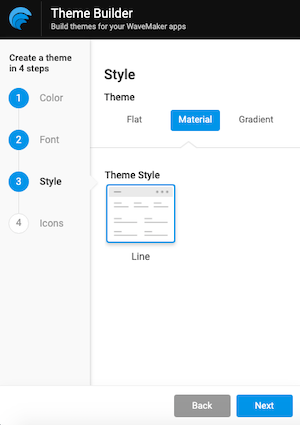
How to build a theme
- Go to https://apps.wavemakeronline.com/Theme_Builder/#/Dashboard
- Click on the Explore/Create themes
- On the Editor page, customize the #HEX values with your brand colors.
- Select applicable font-family and sizes for your content and heading texts.
- Switch between styles types to suit your requirement accordingly.
- Icons changes are in progress (coming soon)
- Click done, and give a name to your newly created theme from the dialog.
- Import and apply the downloaded theme into any of your WaveMaker applications.
Modifying all the variables in your editor will create your new theme ready to download. Once provided a name, the theme will be downloaded as a .zip file. Import and apply to the WaveMaker built applications.
Bingo! We are ready with the theme.
What's next
In the next release version, we will feature the icons and more styling options.
Update: Check out additions we made in the second release since this announcement.
See Also
For more information on developing themes, see Creating themes.