Mobile design has come a long way from boxed-in layouts and padded screens. With modern devices offering bezel-less displays and immersive user experiences, it's become essential for apps to keep up with edge-to-edge UI standards. Until now, our mobile apps didn't fully embrace this capability—but that changes today.
We're excited to introduce full support for edge-to-edge mobile experiences in our platform. Whether you want a completely immersive layout or prefer to keep safe insets and margins, it's now up to you. With this release, we're giving developers complete control over how their apps appear—ensuring your product looks and feels modern, fluid, and native.
Existing App Behaviour
Up to this point, all our React Native apps:
- Included default safe area insets around system UI elements (status bar and navigation bar)
- Used fixed top and bottom navbars, regardless of scroll behaviour
While this ensured content never overlapped with system bars, it came at the cost of:
- Wasted screen real estate
- A dated and boxed-in look
- A disjointed experience on modern, gesture-based devices.
What Has Changed?
We've made key enhancements to give you full control over your app's layout and behaviour:
1. Edge-to-Edge Layout Support
Apps can now optionally render content behind system bars, taking full advantage of the entire screen. This gives a sleek, modern feel and allows your app to better match today's immersive design trends.
Toggle on or off with a single setting—no code changes required.
2. Customisable Navbar Scroll Behaviour
You now have the flexibility to define how your top and bottom navigation bars behave during scroll events:
- Keep them fixed for consistency
- or, Make them scroll with content for a more fluid experience
These options help tailor your app's navigation dynamics to suit your specific UX goals.
How to Use It:
All related configurations are now centralised for ease of use.
Navigate to: Studio ⇒ Settings ⇒ App Configurations
There, you'll find:
- Toggle switch for enabling/disabling edge-to-edge layout.
- Scroll behaviour settings for top and bottom navbars
- Inline video demos showcasing the impact of each setting
🎥 Watch our video guide for a step-by-step walkthrough.
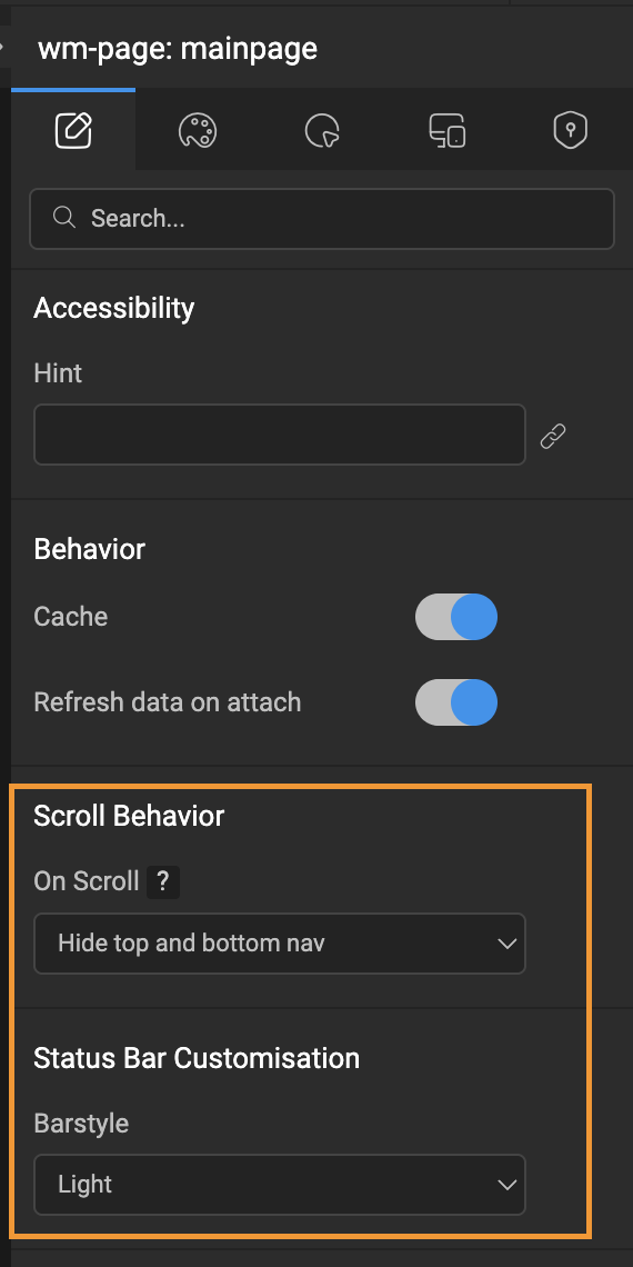
Page-Level Customisation for Scroll Behaviour & Status Bar Style
While app-level configurations work well for most scenarios, there are cases where you might want different behaviours on specific screens. To support this flexibility, we've introduced two new props for the Page widget in mobile apps:
1. ScrollBehaviour (Page-Level Scroll Configuration)
This works exactly like the app-level scroll behaviour setting, but with higher precedence.
For example:
- If the app-level configuration is set to "Hide Top Nav"
- But a specific page (say, DemoPage) is set to "None"
- Then: all pages will hide the top navbar on scroll except DemoPage, which will have no scroll effect on navbars.
This allows you to fine-tune navigation dynamics per screen—ideal for pages that require a different layout experience.
2. barStyle (Android Status Bar Text/Icon Color)
This prop controls the color of the status bar content (text and icons), ensuring it matches the visual theme of your page.
- Use "light-content" for light text on dark backgrounds
- Use "dark-content" for dark text on light backgrounds
This is particularly useful on Android, where the system does not automatically adjust the status bar style based on background color (unlike iOS).
This prop is Android-only. iOS handles status bar appearance automatically based on screen background and theme.
These additions give you precise control over each screen's behaviour and appearance—ensuring consistency with your design intent, while still honouring global app-level defaults.
The Comparison:
Conclusion:
Design is more than just how things look—it's how they feel in the hands of your users. With edge-to-edge support and flexible navigation behaviours, we're giving you the tools to build mobile apps that not only look modern but feel right at home on today's devices.
This update isn't just about aesthetics—it's about giving developers and designers the freedom to choose what works best for their experience. Whether you're optimising for content immersion, conserving space, or enhancing fluidity in navigation, the control is now yours.
We're excited to see how you bring these enhancements to life. Try it out, experiment with the new options, and craft an app experience that truly reflects your product's vision.