Theme Builder app has introduced a new feature for recognizing a website color palette by inserting the website URL. With this, you can discover the colors used in a website and use them to build a theme. It will essentially make the theme-building process much easier by allowing you to choose the discovered colors, fonts, and more from an existing website. Furthermore, you can preview and design WaveMaker components by assigning colors, and download the theme when ready. For more information about creating a theme without any coding, see Creating a Theme using Theme Builder.
With WaveMaker 10.6 release, we have fixed a few bugs. Know more details here.
Input URL
New feature Step-2 unlocked for Generating Theme Colors
Introduced a new flow to identify the colors of a website using the Input URL option. Follow the steps below to use this feature.
- Go to the Dashboard page of the Theme builder app.
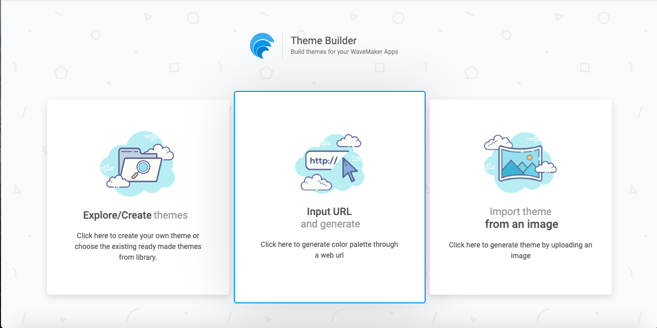
- Click *Input URL and generate*.

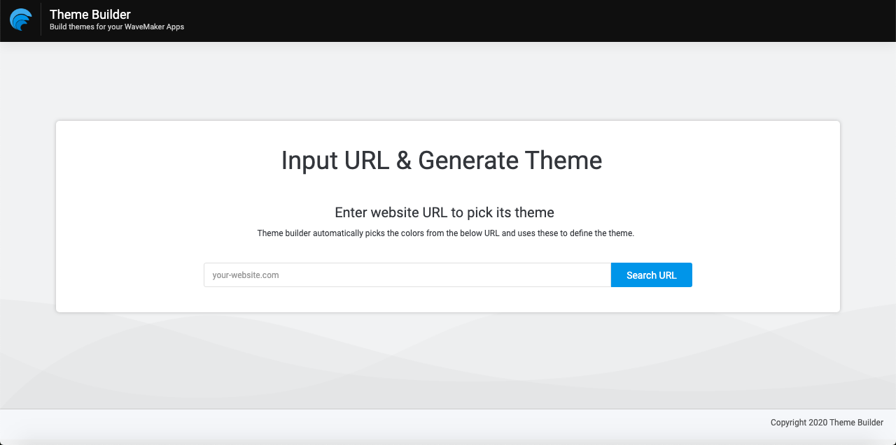
- Enter a website URL. For example,
https://www.google.com/, and click Search URL to generate the color palette of the website.

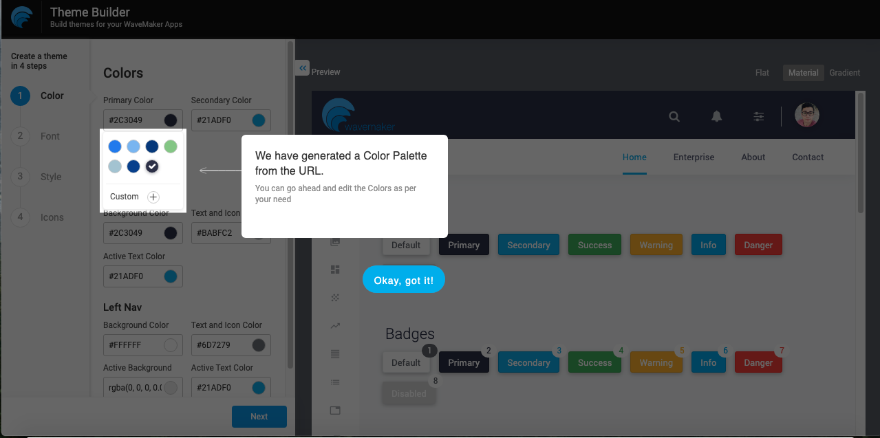
- A prompting message displays on the Editor page with the generated colors with a maximum of six colors that are highlighted. However, the preview application continues to use the default colors of the existing Material theme.

- You can design WaveMaker components with the new colors and preview them right away.
The generated colors are available for all the input fields. Choose the colors from the dropdown as per your branding needs.
- When ready, download the theme.
For information on how to import a theme, see Importing Theme.
Bug Fixes
- The list widget data is now replaced with the real data in the preview application.
- A new page template called
Dashboard1is newly included for the preview application. You can navigate it from the left navbar. - Added Panel Secondary to the preview application to check the color changes for the secondary theme color.
- Fixed issue related to gradient background that was not consistent for widgets when previewing the application switching to gradient theme for UI elements, including Nav, List, Panel backgrounds, Checkboxes, and Radio buttons.
- Changed the default option for the Spacing property in General Settings from
defaulttocomfortableto match the default Material-2.0 theme. - Fixed issue related to Border radius panels that were not consistent when changing from none, less, and more.
- Fixed the list item active state that did not match the color selected for the gradient theme in the left navigation.
- Fixed the state colors that did not reflect the tiles widget.
That's all for now. See you soon with more updates.